Artist represents the world's leading diseases on world map
Every minute, thousands of people are born and die around the world. But did you ever stop to wonder what are the major diseases of every part of the planet?
Just as the habits and culture of each country are different, so do diseases that vary according to the part of the world in which you live. Bringing art and biology together, an artist created an unprecedented representation of the world map that can be considered the “geography of disease”.
Understand the map
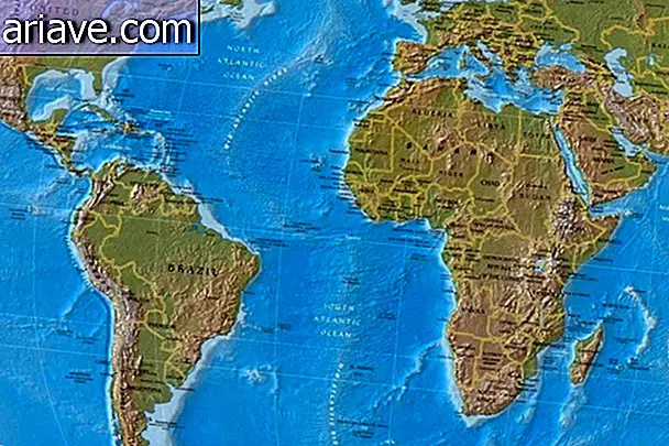
According to the New Scientist website, each continent has been illustrated with body part cells that, when sick or dysfunctional, are the leading cause of death in that region. In North America, for example, the obesity epidemic has resulted in a map filled with fat cells, the ones that make up adipose tissue.
Already Europe and Russia are illustrated by brain tissue, which represents the neurodegenerative diseases that affect the elderly population. Also, East Asia and the Pacific Ocean region are formed by pancreatic tissue, which, when dysfunctional, can result in the onset of diabetes.
Africa has been represented by blood cells, as the most killer diseases on the continent - malaria and HIV - are transmitted through it. Brazil and the rest of South America were represented by lung cells due to the large number of deaths caused by smoking and respiratory infections.

Odra Noel, the map maker, is a doctor who chose to use her knowledge of organs, tissues and cells to go beyond her clinical work. The image you see above was painted in silk as a way to evoke the maps that were previously drawn.
Odra Noel's work will be on display tomorrow, July 2, at the Royal Society's Summer Science Exhibition - a science and technology festival - in London, England.


Recommended